KB COACHING
BRAND REFRESH
BRIEF
Kristin Baker, founder of KB Coaching, needed a refined brand identity that reflected the depth and care of her coaching work. As a leadership coach for women and working mothers, Kristin empowers clients to thrive in both career and family life without sacrificing their well-being. She wanted a brand that felt high-end and polished, yet warm and grounded — one that reflected her values of empowerment, balance, and authenticity, while honoring her personal story and signature style. We began by reviewing what worked (and what didn’t) in her existing brand identity, using her insights to shape a new visual direction.
SOLUTION
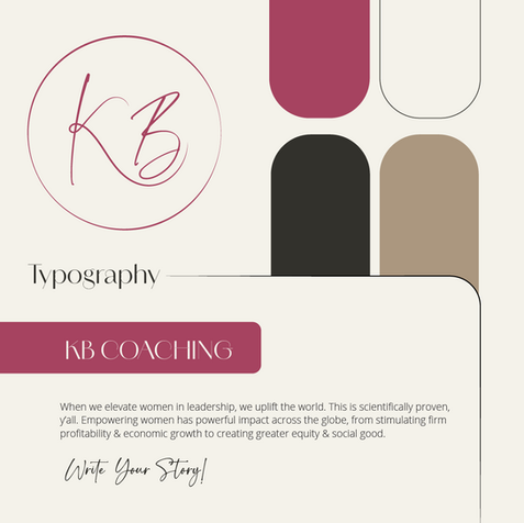
The refreshed brand blends sophistication with calm support — featuring clean, luxe typography, delicate nature-inspired linework, and a rich, confident color palette centered on Kristin’s signature pink. The visual direction captures power and professionalism with an elevated, feminine feel. The logo symbolizes the harmony between leading, parenting, and self-nourishment — all central to Kristin’s approach — and subtly nods to a meaningful brand noun we uncovered together. Once the logo and direction were in place, I created a full brand guide with custom assets and mockups to ensure everything felt cohesive and aligned with her vision and values.


