ENERGY ELEVATION ACADEMY
VISUAL IDENTITY
BRIEF
The Energy Elevation Academy helps spiritually-curious humans reclaim their energy, rise out of burnout, and realign with their true purpose. The program combines energetic cleansing, chakra alignment, boundary work, and daily rituals to create deep, lasting transformation. The brand needed to feel elevated, polished, and soulfully magnetic, reflecting clarity, alignment, and personal growth.
SOLUTION
The visual identity blends cosmic inspiration with refined, feminine energy. A rich palette of midnight blue, soft purple, and golden tan evokes depth, elegance, and spiritual alignment. Clean lines, celestial symbols, and refined typography create a sense of clarity and connection.
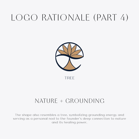
The logo embodies flowing, upward energy through the Seed of Life, a sacred geometric symbol representing creation and interconnectedness. A subtle “E” integrates into a frequency-inspired wave, connecting the symbol to the wordmark. Its upward, fan-like expansion evokes personal growth and energetic ascension, while a tree-like form grounds the brand in nature and healing energy.
Together, these elements create a visual identity that feels expansive, intentional, and energetically aligned, reflecting the Academy’s mission to help people rise into clarity, confidence, and their most empowered selves.


